5 Big Mistakes To Avoid in Your QR Code Marketing Campaign
August 2, 2011The Adaptive SEO Approach (And How To Get More Conversions)
August 16, 2011By
Testing and optimizing landing pages can be a fun and frustrating game of cat and mouse. Every time the mouse gets away, it feels like self-inflicted sabotage. After all, as marketers we really don’t want to eat the mouse, we’re just inviting them to play!
- The headline
- The product image
- The call-to-action
- The copy
- The page layout
Over half of these elements involve design, yet the majority of conversations on “how to increase landing page click-thrus” have to do with optimizing copy. In this article I’ll focus on the importance of your landing page design, and specifically how to avoid making these mistakes:
- Lack of Balance between Images and Copy
- Not Optimizing for Mobile
- Letting your Brand Control the Color Scheme
- Using Images that do Not Evoke an Emotional Response
- Using Navigation on the Page
- Testing too many Design Changes at Once
- Not Giving Your Layout some Breathing Room
- Saying too Much at Once
Ok y’all ready?
1. Lack of Balance between Images/Video and Copy
I’m a huge fan of great copy, but landing pages that rely too heavily on copy and do not:
- show the quality of the product
- an image that illustrates my pain point
- or how the product or service relieves that pain
Lack of imagery means you miss out on the opportunity to add another (visual) layer of connection and communication with visitors.
If you haven’t already, stop by Karri Flatla’s site and pick up her free “short copy” copywriting report “Sales Page Relief Manifesto“. Karri makes a great point that as the web has matured, so have consumers eye for quality products. Long, copy-heavy sales pages are not what an increasingly savvy web consumer is looking for when there are other, more professionally presented options.
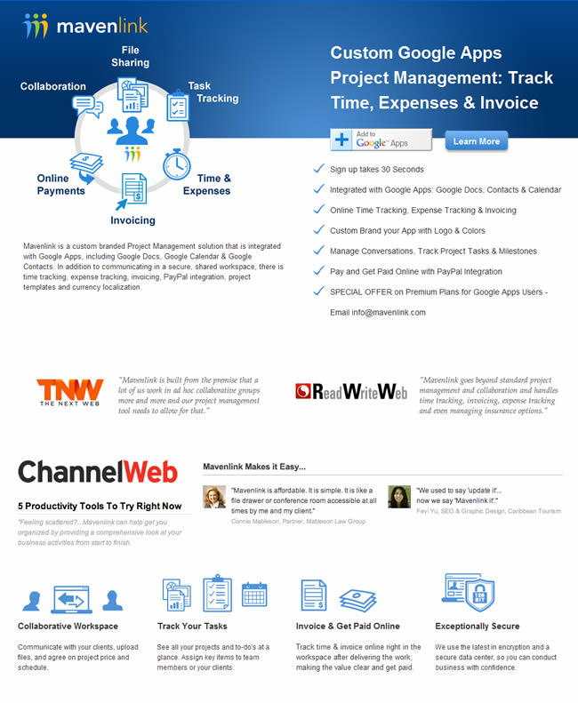
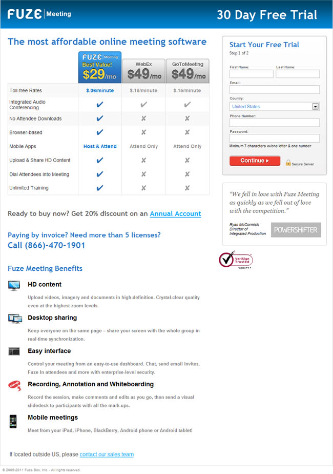
Check out the examples below with an over-emphasis on copy and lack of images. Notice anything? It takes longer to figure out exactly what they’re offering!
Don’t forget about video
Great copy does not have to live in text format alone. Consider ways your copy can also be published as a video. There are lots of producers of “explanatory videos” that can bring your copy to life in ways that will:
- Keep the visitors attention
- Tell your story (in a succinct and unique way)
- Show them how your product or service actually works!
Even if you don’t hire someone to create the video for you, doing a simple screencast of what you have to offer is helpful. For a list of screencasting software tools and explanatory video producers, see the list in the “Resources” section below.
Do this next:
- Create a “Design Document” for your Landing Page, using this design document template to start. This is where you will document the content that will live on the page.
- In your design document, create an outline of the landing page content. Include:
- Audience profile
- Audience pain
- Product or service solution. Create a list of features and benefits.
- Conversion goal
- Potential Headlines
- Supporting sub-headlines and content modules
- Call to Action
- For each of the above items, make a note of imagery and/or video that will help deliver the message
- Once you have defined each of these elements, sketch out your landing page on paper. Create several potential layouts for the content you’ve outlined, then pick one as your starting point.
- Do all of the above before before hopping into Photoshop or your Landing Page publishing platform.
Y’all are doin’ great – let’s keep moving. 🙂
2. You are Ignoring Your Mobile Audience
A recent study by the Pew Reserach Center found that one-third of American adults own a smartphone and of that group:
“Some 87% of smartphone owners access the internet or email on their handheld, including two-thirds (68%) who do so on a typical day. “
Are you optimizing for mobile? Oopsie daisy!
What is your behavior when you hit a landing page that is not optimized for mobile? Do you take action? Probably not. Why? Because not only does the design make the page difficult to read, the call to action is typically not optimized for mobile either.
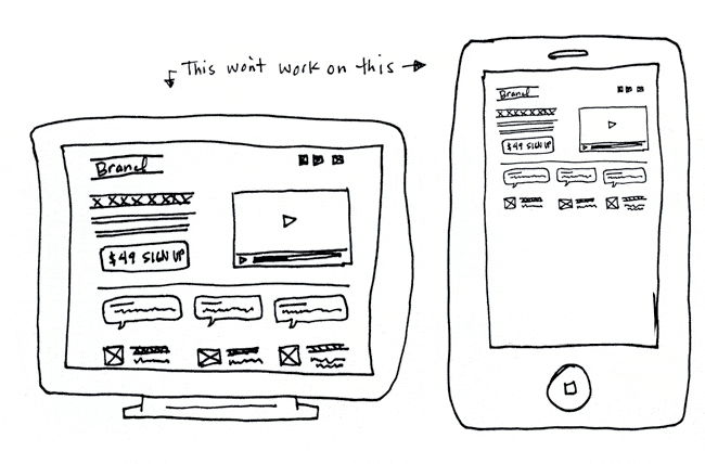
You have to consider the variety of devices where your landing page will be seen, AND the action you’re asking them to take. Again, balance your design and messaging.
The tricky part is you can’t anticipate when people will be using their mobile devices versus their computers. For example, let’s say your landing page goal is to drive sales for your web application. If they hit the page from their mobile device how will they purchase the product? Did you lose a sale just because consumers hit the site on their mobile device and haven’t reached a comfort level with mobile e-commerce?
One solution is to create two designs for your landing pages. One that is optimized for mobile devices and one for your typical desktop and/or laptop web browser. When the visitor hits the URL from a mobile device, a redirect sends them to the mobile optimized design that contains a mobile-friendly call to action.
Do this next:
- In your Design Document, copy and then modify your landing page outline to create a complimentary mobile counterpart. Remember you’re working with a limited screen size so your mobile content outline should look more like this:
- Headline
- Image
- Call to Action – make sure the CTA is within a mobile users comfort zone
Y’all are awesome let’s keep rollin’…
3. Letting Your Brand Control the Color Scheme
As a designer, it is in my DNA to create color palettes and designs that stay “on-brand”, connect with users on an emotional level, and therefore communicate a strong message. Unfortunately what I think works isn’t always what resonates with visitors. I know, I can’t believe it either, but this is why we test.
There is a certain amount of “brand memory” you want to maintain with your visitors. Changing the basics of your brand guidelines is not recommended. However, finding elegant compliments that break out of your defined color scheme is part of the testing process.
It is (for me) a difficult task. Seeing what you thought was a perfectly crafted design getting picked apart. Salt is then rubbed in the wound when you see improved results. This is where you eat humble pie, and simply get used to the fact that your landing page visitors help dictate the design.
As an example, in this A/B test, Performable broke out of their green/grey/white color scheme to test a red call to action button with improved results.

As hard as it is to break out of “brand guidelines” or test a color that the CEO hates, you have to do it. The boss-man will understand when conversions go through the roof. (In this case the red button converted 21% better).
Do this next:
- In your Design Document, add a section to define color palette options. For example you might list out different hexadecimal colors for:
- Headlines
- Call to Action Buttons
- Background Colors or Patterns
Can y’all smell the mouse getting closer?
4. Your Images do not Evoke an Emotional Response
Paras Chopra’s article on how “Human Photos Double Your Conversion Rate” explains how we can use imagery to influence connection with our audience:
“It is a well studied scientific fact that in a scene or image full of different objects, one’s attention is subconsciously drawn to human faces. Even toddlers and monkeys look towards faces for a much longer duration than they’d look at other objects.”
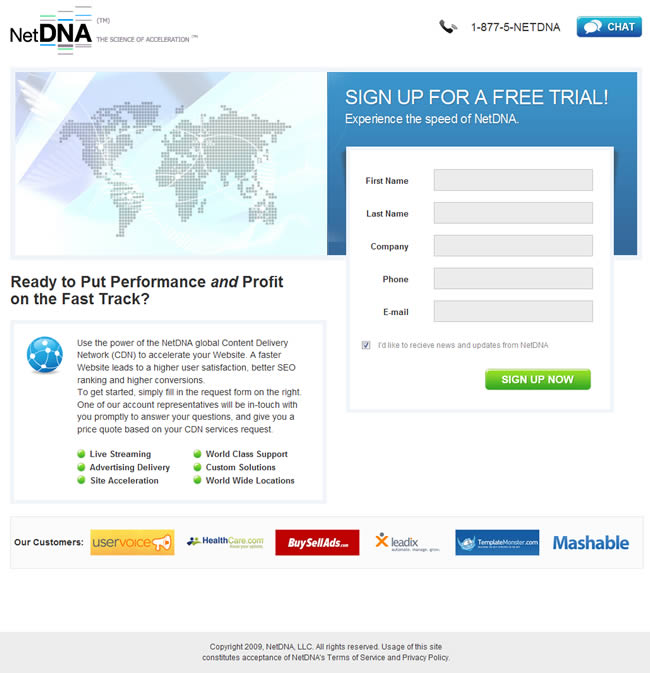
Check out the below landing page. Does this US map punch you in the gut or explain anything about the service this company offers?
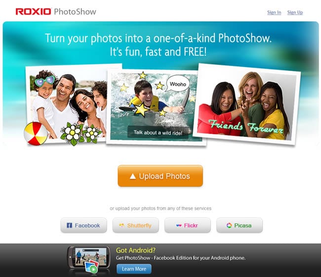
What about this landing page? Not only does the image quickly explain the product, it also backs up the claim that it is “fun” to use!
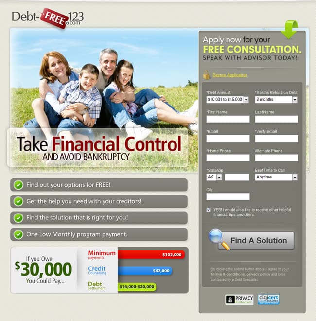
This page for Debt Free 123 is an excellent example of a page that dials in on a pain point and illustrates the “result” of using their products: A happy, debt-free family.
In the example below, Super Circuits goes with a striking image of every homeowner’s worst nightmare, rather than opting for an image of the equipment they sell. Excellent choice.
Another nice touch is the video camera directs your eye towards the opt-in form. Subtle and effective use of graphics!

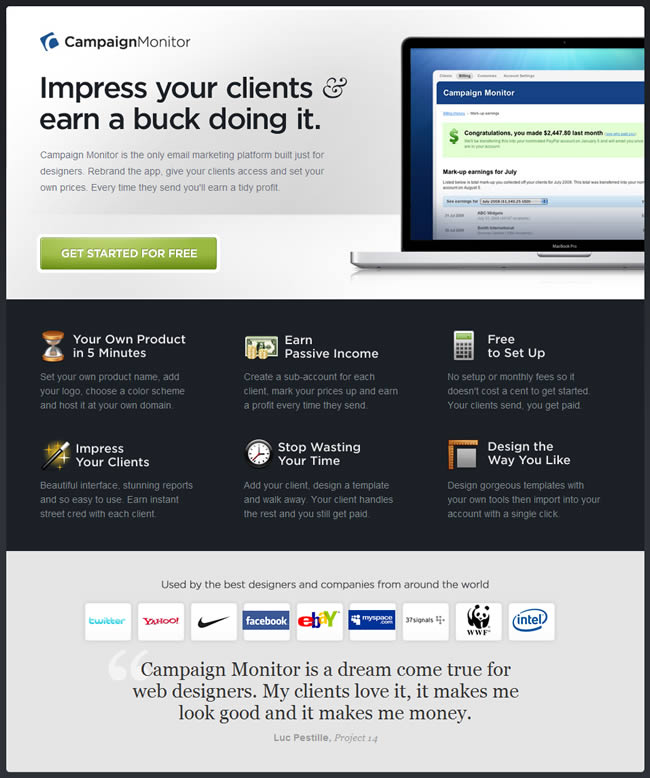
And it is not just human faces that evoke an emotional response with your visitors. Showing a image that resolves a pain point is also effective. Check out how Campaign Monitor marries a punchy headline and image, tapping into a designer’s desire for passive income by managing their client’s email campaigns.
Do this next:
- In your Design Document, review the images you have selected to include in your outline. Ask yourself what they will make your visitors feel. If the emotional response is nil or not supporting your message, keep searching until you find the right match.
Before things get too “emotional” let’s move y’all along…
5. Using Navigation on the Page
I unwittingly tested this well-documented fact on a page I designed for the Landing Page Design Kit.
The kit includes 100’s of landing page design resources that (I presumed) would need to be be showcased in actual-size, on a long sales page. Because the page was so long, I opted for a navigation bar on the left that jumped users up and down the page to view the graphical assets they were interested in.
As you can see from the heatmap images below (created using Crazy Egg), visitors were so busy clicking up and down the page using the left nav, they ignored the “download” call to action button.

Any navigation that does not move your visitor towards the landing page goals can actually distract the user from taking the desired action!
Do this next:
- If your page includes any navigational elements that are not related to the Call to Action, think carefully about what purpose the link serves. If it’s not moving your visitor down towards your CTA, remove it and test the change.
Don’t y’all love CrazyEgg? I do.
6. Testing too many Design Changes at Once
This is pretty obvious, but worth mentioning. When a page is not performing well, I tend to want to overhaul the page, and then test it against the poorly performing page. Approaching design changes in this way does not tell you which of the many changes you made is having a affect!
Take a deep breath and test one design change at a time. Let the page get a significant amount of traffic before moving forward with another change. Twenty visits to a test isn’t going to give you a true marker of how the majority of visitors will interact with your page.
Do this next:
- In your design document, define a list of 5 items you want to test, and the milestones the will trigger each test. For example, you may define that a change takes place every 1,000 visitors, or every 2 weeks.
Are y’all still hangin’ with me here? Cool 🙂
7. Not Giving Your Layout some Breathing Room
Giving your landing page design space to breathe will save you a lot of time when you’re tweaking the design for A/B testing.
For example, imagine you’re testing a button that has a copy change, requiring it to be 20px longer. Does your layout allow for a wider button?
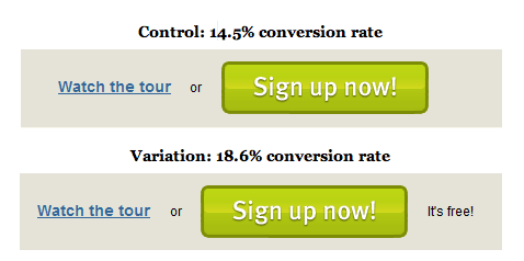
Or what if you want to test adding just a couple of words to your call to action as Soocial did in this example. Adding two words beside the CTA button increased conversions on this page by 28%. Luckily the button does not have anything on the right side, and the “it’s free” copy has plenty of space to live.
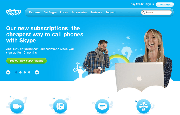
In the below example, Skype allows a lot of space in the header image to have a longer headline and experiment with button text.
Do this next:
- In the landing page sketches you created earlier, review them for breathing room.
If my point isn’t clear, y’all just pretend your landing page elements are claustrophobic.
8. Saying too Much at Once
If a visitor to your page is confused, the likelihood of them taking the action you desire is slim. Visual clutter is one of the top reasons visitors abandon a landing page.
Check out this example from Which Test Won, where the clearer Version A beat out the form layered over the image. A quote I always keep in mind when I’m designing is by Antoine De Saint-Exupery:
“A designer knows he has achieved perfection not when there is nothing left to add, but when there is nothing left to take away.”
Do this next:
- Review your Design Document and look for redundancies or pieces of content that do not support the main message or Call to Action. Remove the clutter!
Have I overwhelmed y’all yet? I hope not!
Bookmark this post and use it as a reference point for your next landing page design project.
After all, don’t you want this…
