Making Sure your LinkedIn Profile Doesn’t Suck
October 8, 2010Apple On Track To Overtake Microsoft With $20 Billion Quarter
October 11, 2010by via http://sixrevisions.com

The web is constantly evolving. It doesn’t take a rocket scientist to see how quickly new technologies are being adopted and how fragile design trends are. While the web is still an infant relative to other mediums such as print, TV and radio, and still has fair amount of growing up to do, it has already amassed a rich history. Let’s take a look at how the medium has evolved throughout the years.
A Matter of Carbon Dating
Evolution is inevitable. As British philosopher Herbert Spencer put it — inspired by Charles Darwin’s theory on natural selection — it’s “survival of the fittest.”
If we examine any aspect of web design, we can see that trends and technologies being discarded, improved on, or superseded by something better is common. Evolve or die, pick one of the two options. And if we delve deeper, we can see three core elements that dictate this natural selection and evolution.
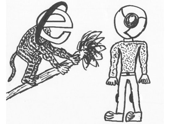
Certain web browsers tend to be more evolved than others!
Code
One of the core elements of the web is code. As web designers and web developers, the success of a particular language largely depends on how much value it brings to our work. I’m sure only a handful of you remember VRML with the fondness of the concept that we could soon be browsing the web using the same virtual reality as used in the movie Tron. Alas, virtual reality didn’t take off.

The idea of virtual reality and 3D objects fascinated developers.
Web Browsing Devices
The second core element that dictates the web’s progress are web-browsing devices. As technologies evolve, as browsers are improved, as browsing methods change, so do we as an industry.
Things have come a long way from IE3 on an i486 computer with a 56k modem that made a screeching sound like a harpy as it connected to the “Net” through AOL. We can see the fossils of our past exist in computers that still have IE6 and Lynx, poking around our websites on occasion (much to our dismay).
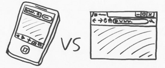
Devices come in all shapes and sizes, from cell phones to browsers.
Trends and Conventions
Finally, we have trends and conventions. No, I’m not talking about the latest fashion according to Lady Gaga, but of design trends, design patterns and conventions that have gained acceptance as the norm because they are proven to work well. Things that are known to enhance the user experience and conventions that aren’t so annoying that you have to avert your eyes to avoid suffering a brain hemorrhage (that’s why the neon pink against a yellow background color scheme never quite took off).

Trends and conventions come in a whole range of shapes and sizes.
Single-Celled Organisms
When the web first started, it was much like a single-celled organism — strong, resilient yet simple. We didn’t have the need (or ability to have) dynamic behavior, database-driven pages and sophisticated web layouts; the web was about sharing text (and some images) and nothing more. Things needed to progress further to gain mass adoption and appeal.
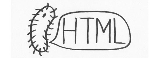
Back in the early days, things were much simpler. Just like microorganisms!
If you’ve ever seen the first pages created by Tim Berners-Lee, you would see that the original idea was simply to be able to connect and relate disparate text pages by way of hyperlinks.

The web started with text and hyperlinks, but now it’s more complicated.
Post the success of the early internet, thoughts of actually doing something more visually intriguing with code (to make the text look extra awesome) started to emerge. While the HTML standard kept evolving to push the envelope further, web browsers began breeding their own webs of “unique” (read as proprietary) evolutions. And as with most children, it was inevitable that tantrums kicked off in the face of adversity.

Vendor prefixes exist to this day, though they’re much better organized.
Biodiversity in Design
Moving away from the lackluster ideals of just having text and images, the HTML specification grew to include all sorts of wonderful opportunities to begin laying out content. It started with table-based designs and simple multi-column web pages. Then we got CSS, which enabled us to style our content so that they looked nothing like the typical white background, black text, and blue underlined hyperlinks cliché. And finally, we saw an evolution towards more complex organisms.
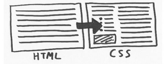
We went from an era of blocks of text to stuff that can be positioned with CSS.
As the Borg said, “resistance is futile,” and the fertile soil that grew the early seeds of the web blossomed to increase our capabilities. Perl, PHP, applets, client-side scripting allowed us to do more than just display content, but also to give site visitors (“web surfers”) a way to interact with our pages.
While all of this growing and adoption was taking place, the browser-makers of the time (IE and Netscape), in an attempt to out-do each other and gain supreme dominance over the market, decided to start making things up as they went along. They created proprietary specifications, languages and custom code.
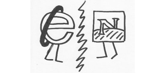
Internet Explorer and Netscape went at each other like Alien versus Predator!
As people began to experiment with this thing called a “website,” many enthusiastic developers saw themselves able to achieve some of the most wonderfully annoying techniques to exist in our craft. Often coded with little attention to detail, the amount of alert boxes asking for your name, popup windows, right-click-crippling events, JavaScript clocks, site counters, and other strange things appeared in the boatloads. Many did it for the novelty or marketing agenda, most never thought about the user.

Anti-right-click scripts got thrown about in a futile attempt to curb digital piracy.
Luckily, something changed in the ethos toward the web.
With the birth of style and scripts, the adoption of standards became important. With browsers telling you to code in different ways, things began to conflict — and that wasn’t fun for anyone.

Some browsers like Opera have remained standards-focused since their inception.
Part of the natural evolutionary process is based around the concept of natural selection: The organism that is better suited for the environment wins by outcompeting weaker organisms. The evolution of web browsers and competition certainly represented that. In code, multiple competing languages were produced for specific uses (i.e., RSS versus Atom) and this healthy competition led to the aftershock of innovation from developers and an imaginative array of new uses for the web from those pushing the boundaries.
Plenty of languages compete against each other, but this is healthy.
Survival of the Fittest
As we all know, the remnants of the browser wars still exist to this day — JScript, <marquee> and hasLayout immediately come to mind, as do some lost night’s sleep — but this simply highlights the evolution that the web has gone under. We started with a very raw text-sharing and hyperlinking format and within 10 years ended up with a browser bidding war (spoiler alert: Microsoft’s IE triumphed over Netscape).
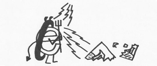
Microsoft won the browser wars by integrating IE within their OS (Windows).
While the idea of the web’s old sites make many of us cringe and reflect upon our own first web portfolios with questions like “Why did I do that?” and “Where did I find that animated GIF?,” the change from what we needed the web to do to what we wanted it to do was bridging ever closer.

Sometimes, the extinction of a proprietary element has been a good thing!
The Wild West philosophy where “everything goes” failed toward the early 2000s as evidenced by the “dot-com bubble” bursting.
Bonzi Buddy was a classic example of people taking the web too far.
But this scenario was almost like a purging of sorts. Out with the old, in with the new. In its place, an age of enlightenment began, with the catalyst simply being that more people were using the internet. This surge of users outside of geeks meant a reform would be needed in the way we designed and developed our websites.
From Primate to People
After surviving the horrors of the 90s web and the early failure to monetize anything online, we breathed a huge sigh of relief that the Y2K bug hadn’t wiped out mankind, and then we moved forward to a more thoughtful process in designing sites.
Gone were the days where the focus was on funneling as much junk to the user as possible. The idea of designing for the user’s experience became interesting. User-centered design. Usability. Accessibility. These were the words being thrown around.

People thought computers and the web would collapse under the Y2K bug!
The old, clumsier days of the web in which design decisions were based around which scrolling statusbar script to use or which dancing Homer Simpson GIF would make you feel better were gone, and a focus toward professional user-centered design, data-driven design decisions, accessibility and usability gained importance. This was partly due to the evolution in our collective mindset as to what made good business sense.

Content and navigational structures became less erratic and more organized.
Looking to the Future
Examining things from a Darwinian perspective displays the web’s change from its various stages of life. The early days where things were much simpler (and less stressful), the later years when many of us cried ourselves to sleep at the thought of making a design for Netscape and IE, the post browser war depression where design became focused on experimentation, and now with user-centered design — it’s been a heck of a ride!
No one knows how this evolutionary story concludes. While the web already has an illustrious history, it’s safe to say that we’ve only just begun.

Usage of the web has increased dramatically, as has the number of websites.
Looking back at the Internet’s past, I find it interesting that we can “carbon date” our sites based on the techniques and technologies they use, and even scarier is that much of the web today remains fossilized within the bedrock of our servers.
While the evolution of the web is going on as we speak, and it’s fascinating to see how trends, code and devices have changed, looking to the future of the web leaves us with limitless possibilities.


